Client
Bordin Bros
Industry
Agriculture
Responsibilities
1:1 interviews, stakeholder presentations, research analysis, wireframes, prototypes, UI design.
Team
Redhanded (Clemenger BBDO)
Webshop
Bordin Bros
Agriculture
1:1 interviews, stakeholder presentations, research analysis, wireframes, prototypes, UI design.
Redhanded (Clemenger BBDO)
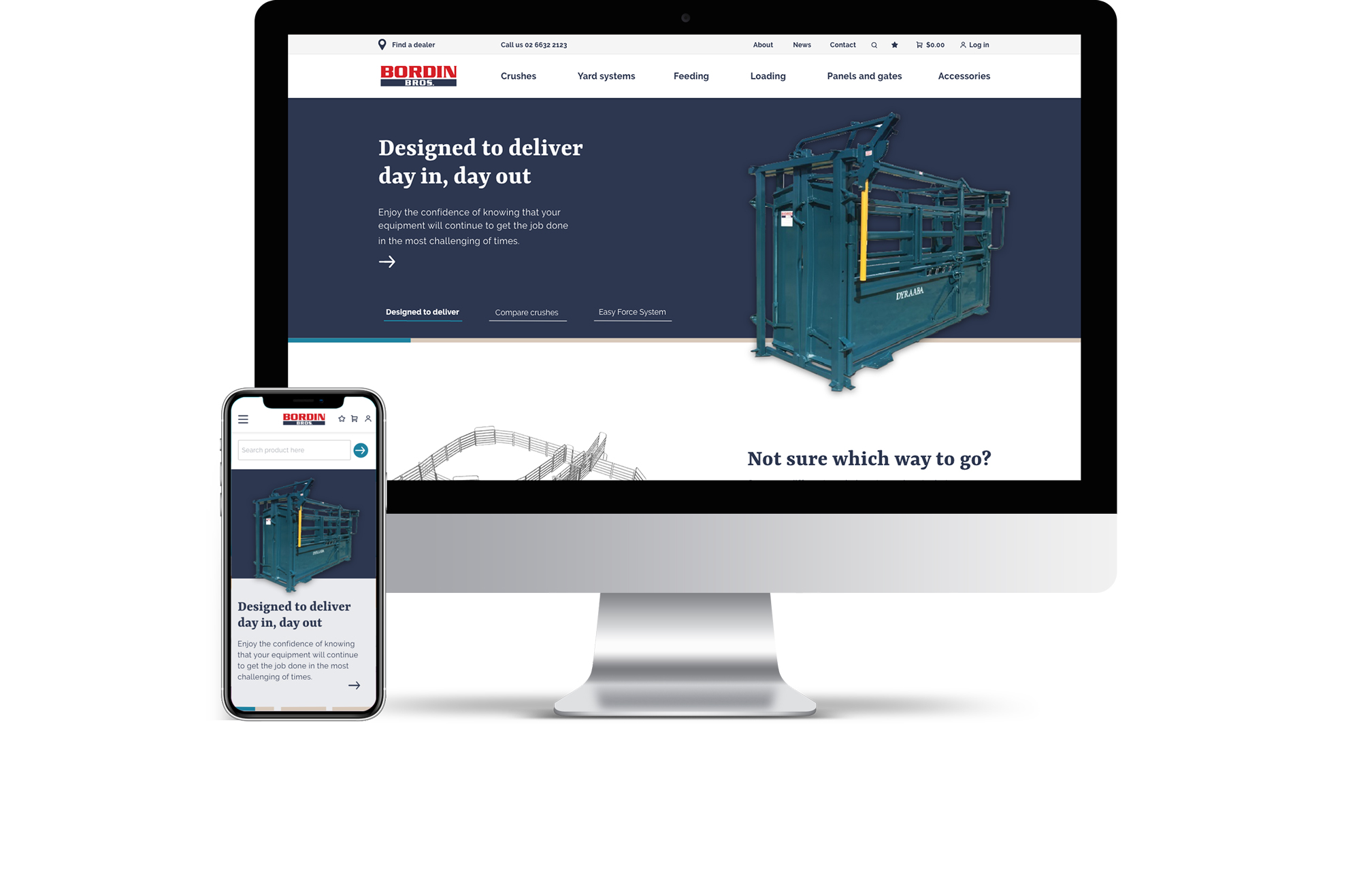
Bordin Bros is a cattle yard equipment manufacturer, a family-owned business in regional Australia. Bordin operates from their main workshop in New South Wales, and relies on dealerships around Australia to sell their products in other parts of the country.
An e-commerce website, where all product applications are explained and where customer can easily compare and purchase products.
As UX Lead on this project, I worked with a Developer and Producer to deliver this product.
We started off with stakeholder interviews to understand and define the problem we needed to solve. We found that our client’s main issue was the lack of control over product information that is provided to its customers by the dealerships. Our client was frustrated about customers receiving inaccurate or incomplete information, and as a result missing out on sales. Moreover, the after-sales tracking and follow-up processes with customers lacked consistency, and is performed manually.
With this in mind, we prepared our customer discussion guide and scheduled our 1:1 user interviews. The main problem for customers concerned difficulty in understanding product differences and their application. It also became clear that this was particularly the case for hobby farmers who generally have less technical expertise.
Throughout the user research phase, we used apps like Miro to categorise our findings and to set up an empathy and customer journey map. From here we translated our client and customer needs into website goals and functionalities, which we presented to our client.
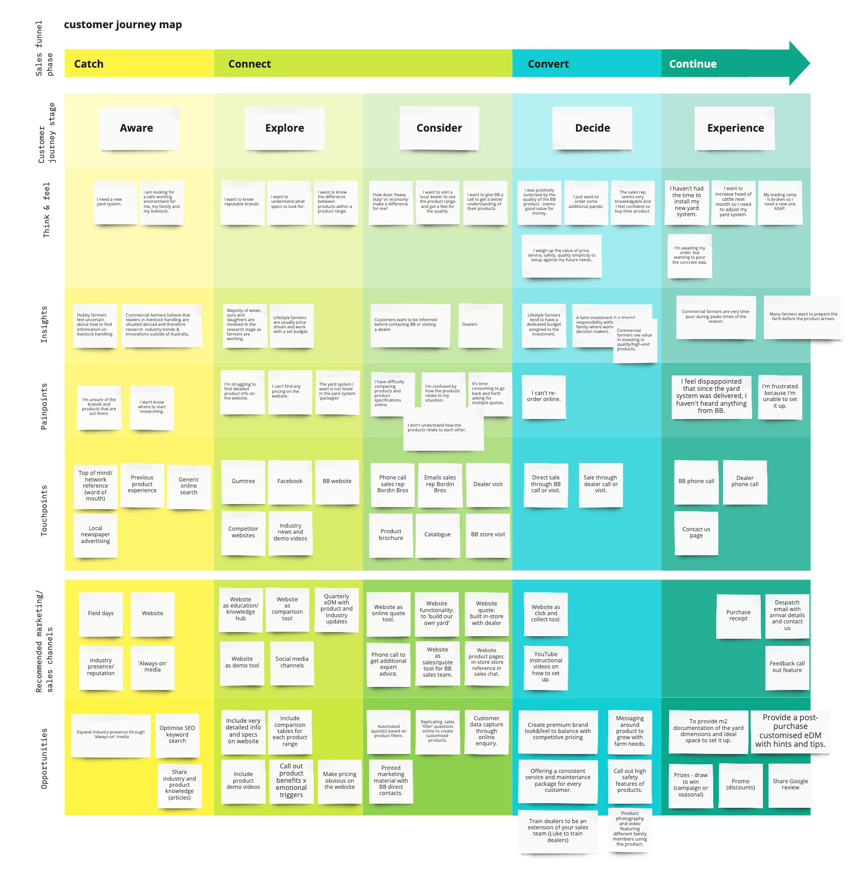
We presented our research insights to the stakeholders, which included an overview of business and customer needs in every customer journey stage. We translated these insights into website goals and functionalities.
First, we analysed the existing client website and created a content inventory and sitemap. From here we developed a new sitemap for the future website that was informed by our research insights.
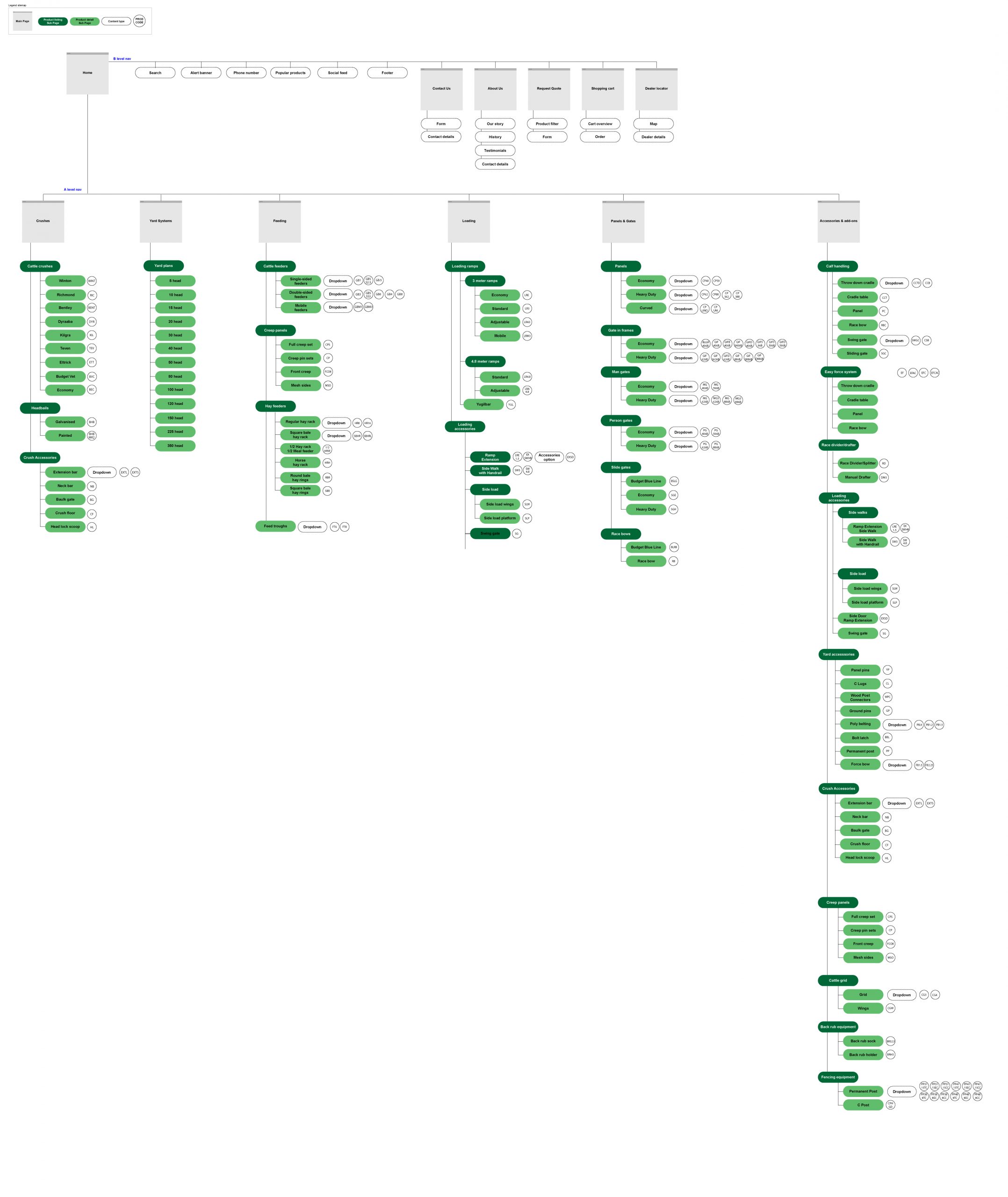
A major change of the new website structure is top-level navigation. Previously, products were categorised based on type of animal. By listening to customers as well as our client, we found out that many products can be used for several animal types. Moreover, cattle products represent the majority of products. We therefore decided to structure the product catalogue in the top-level navigation by product category instead of by animal type.
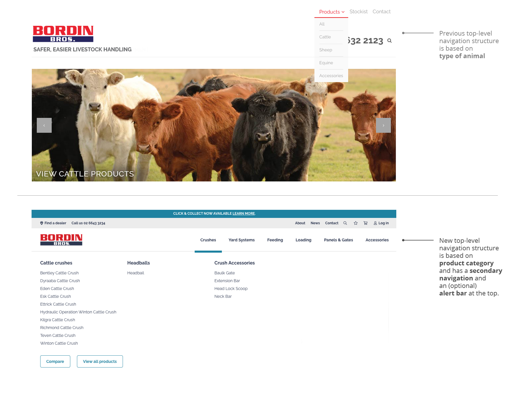
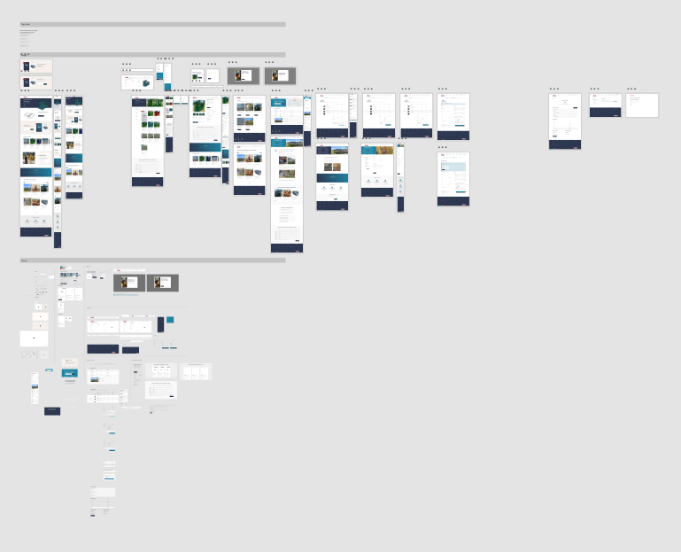
Our prototype was tested among customers as well as client staff. Multiple rounds of feedback were taken into account before the high fidelity designs were developed. The payment flow of the prototype is pictured below.
The final design of this e-commerce website contains multiple functionalities which were included based on customer feedback. This enables users to compare products and to be informed about product details.
