Client
RMIT Melbourne
Industry
Financial Services
Responsibilities
Competitive landscape review, User flows, Usability testing, Prototyping, Branding, UI Design.
Banking app
RMIT Melbourne
Financial Services
Competitive landscape review, User flows, Usability testing, Prototyping, Branding, UI Design.
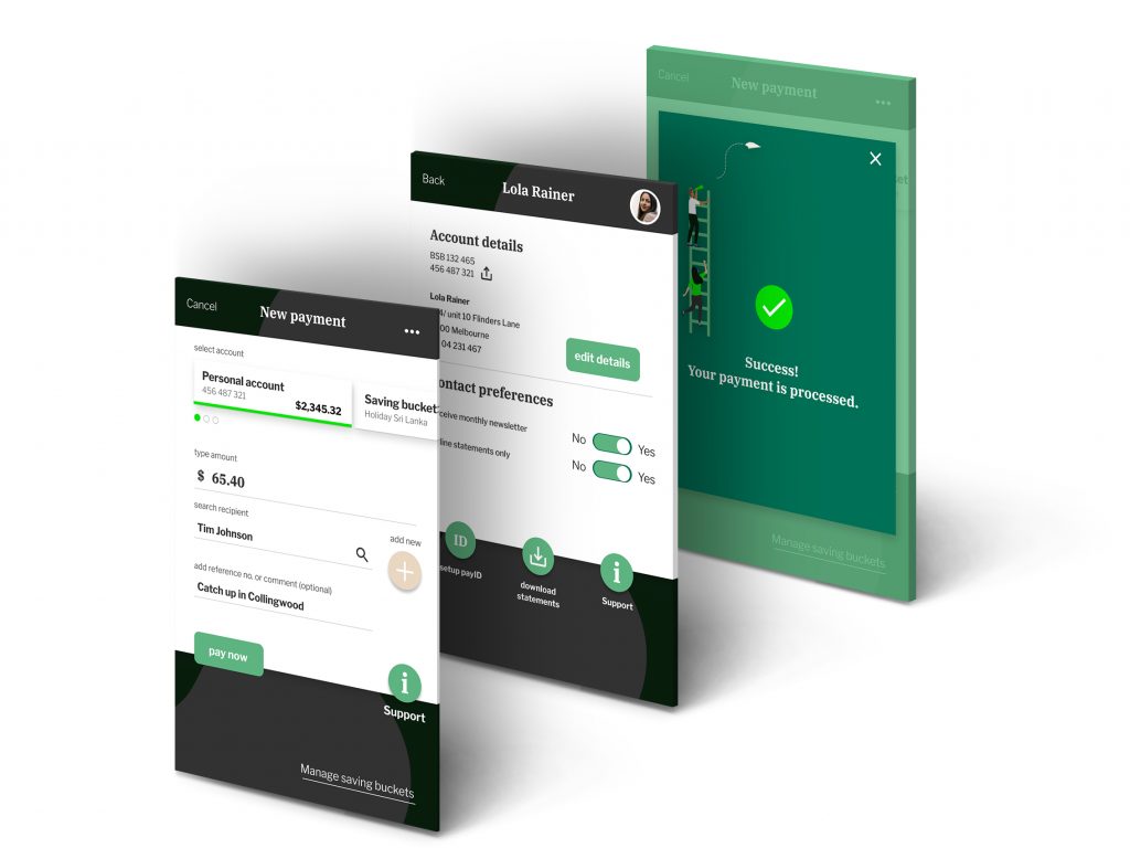
Walley Bank is a new kid on the block in the Australian market and is looking disrupt the banking world by offering a refreshing new banking app that meets the needs of its customers.
My role in this project was to:
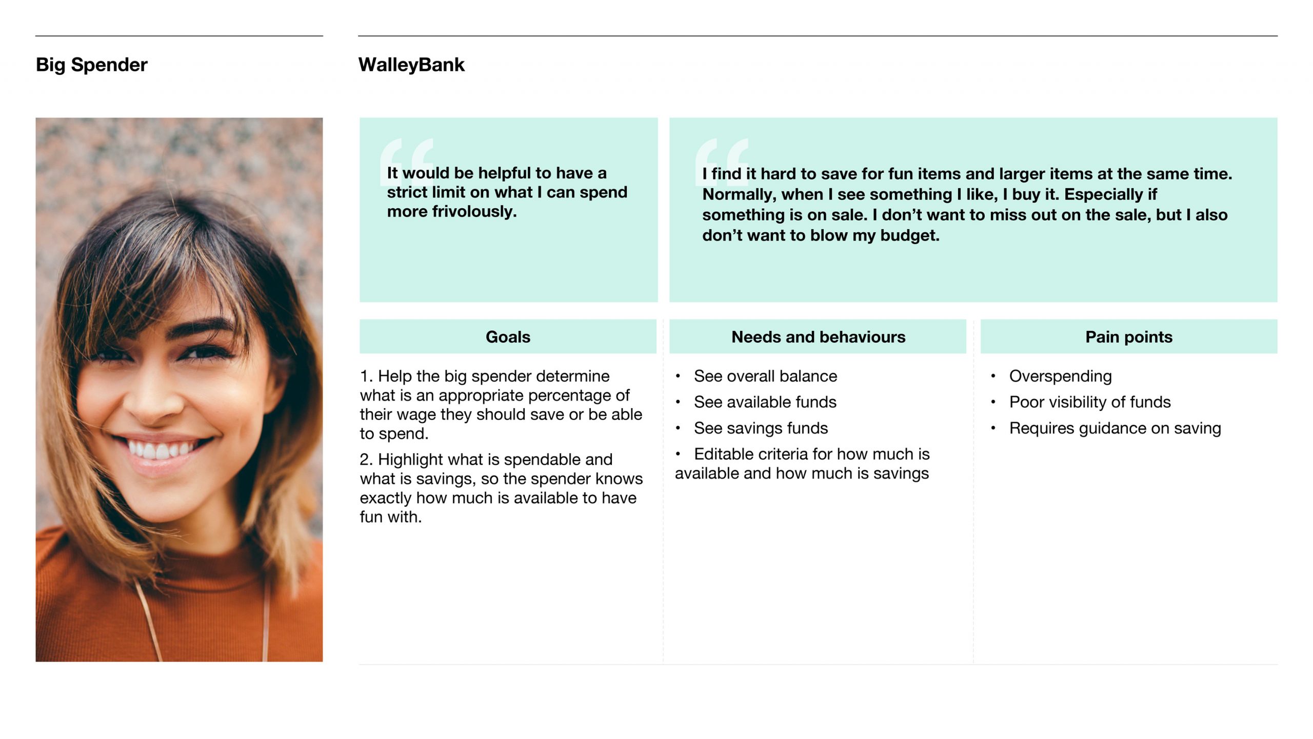
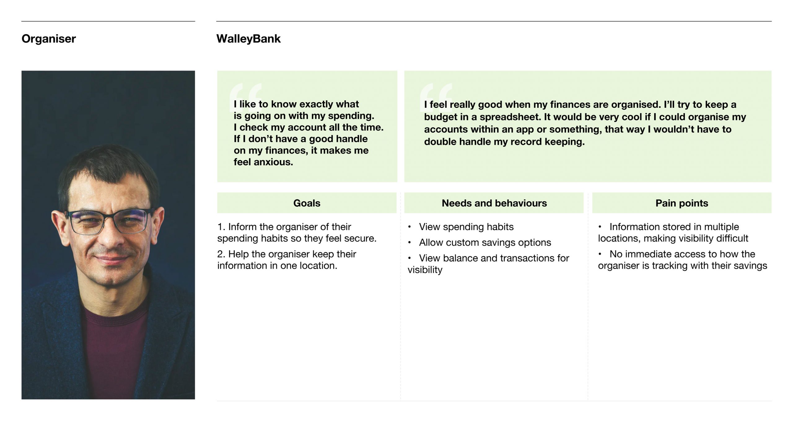
User research has been done and 2 key personas have been identified: The Big Spender and The Organiser. The Big Spender mainly needs support in managing savings, whereas The Organiser is in need of an overview of savings and transactions.
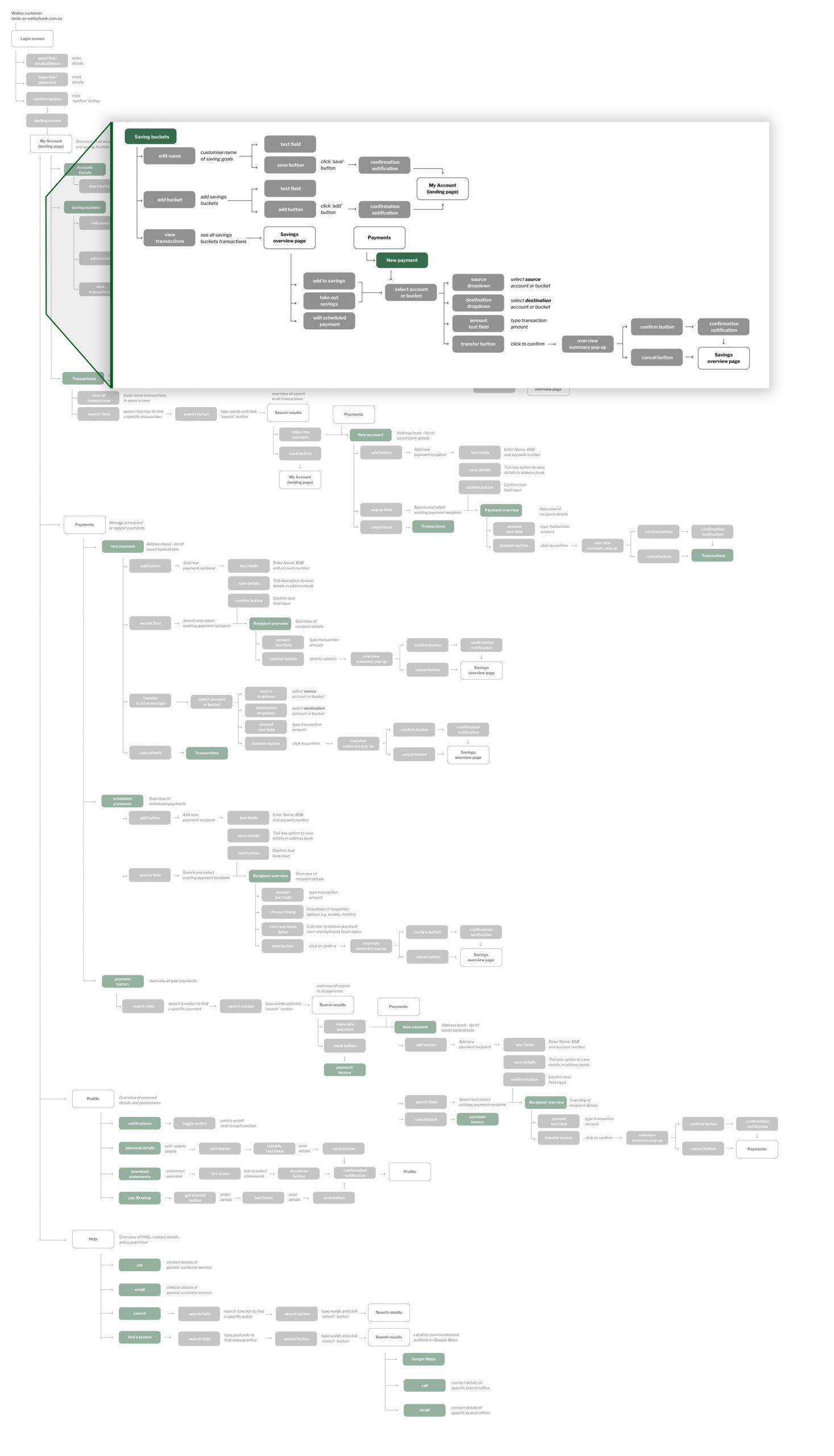
Our flow diagram displays the structure and functionality of the app from a user standpoint. My role for this project was focusing on the savings and new payment sections.
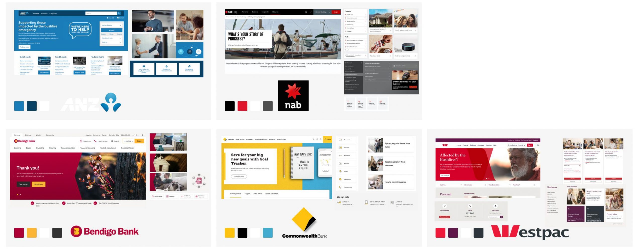
In order for Walley Bank to stand out from the competition, a visual competitor review was our starting point. Looking at the 5 major banks in Australia, we created an overview of their look and feel.
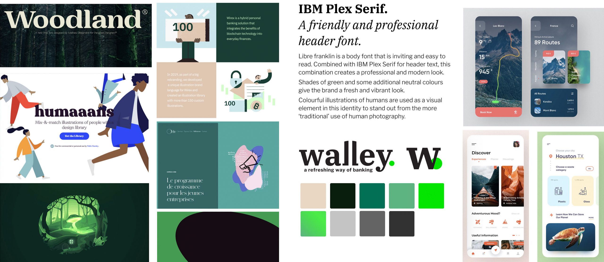
Walley Bank wanted to be different and stand out from the status quo. This moodboard helped us to get a good feel of the visual direction in terms of fonts, shapes, colours and illustrations.
These initial sketches were a starting point to then create the high-fidelity designs.
The designs were tested among 8 users and had to complete the following tasks:
