Client
Academy Xi
Industry
Transport & Infrastructure
Responsibilities
User Interviews, User Survey, Desktop Research, Empathy and Affinity Mapping, Journey Mapping, Wireframing, Prototyping.
Navigation app
Academy Xi
Transport & Infrastructure
User Interviews, User Survey, Desktop Research, Empathy and Affinity Mapping, Journey Mapping, Wireframing, Prototyping.
Poor cycling infrastructure in Melbourne makes it difficult and discouraging to ride a bike. How might we improve navigation for cyclists in Melbourne so that everyone feels comfortable riding a bike?

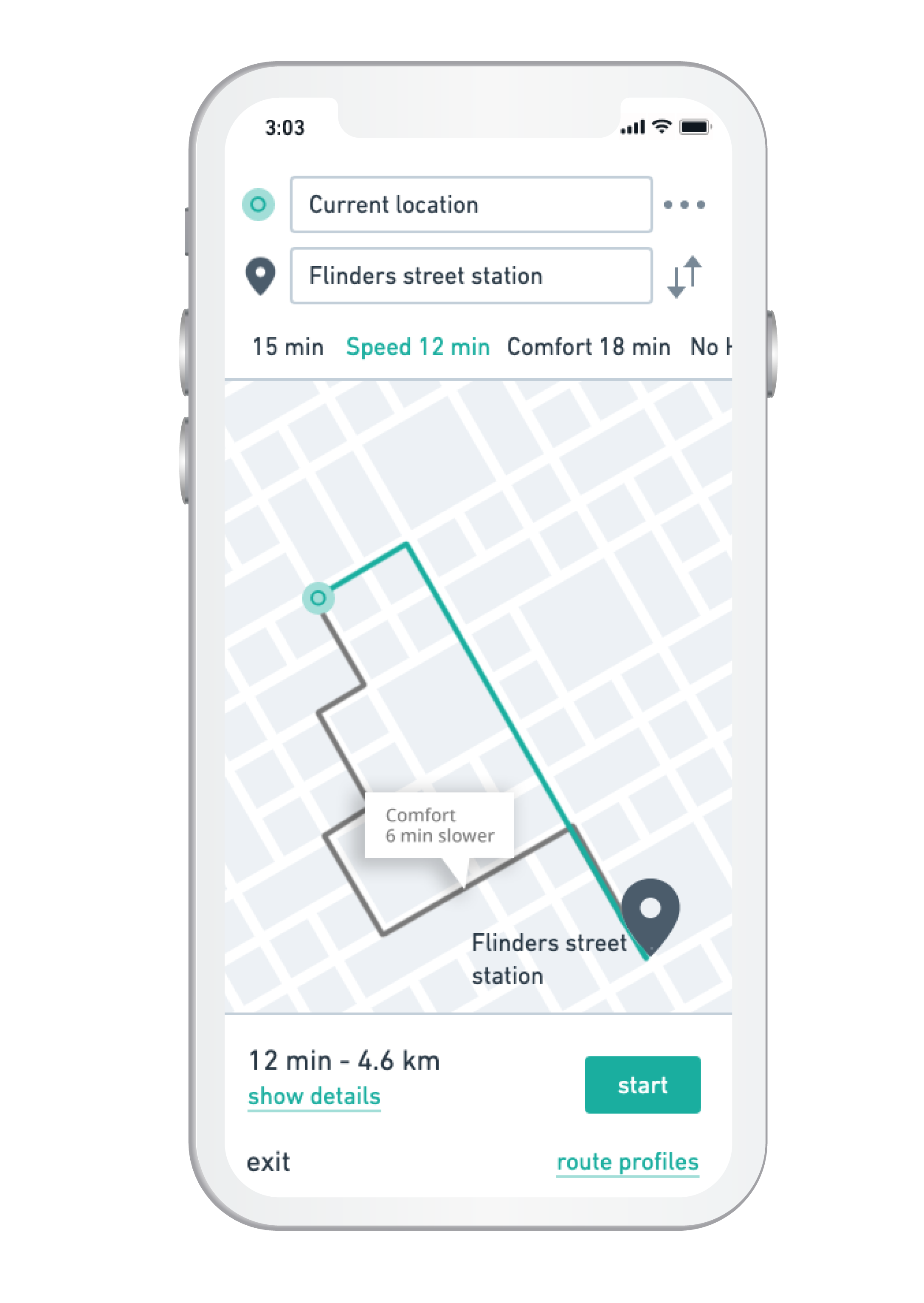
Melbike is a navigation app for cyclists in Melbourne. It offers real-time road and traffic information and can be customised to your cycling needs. The ultimate goal is to make Melburnians feel more confident and safe while riding.
The rider can set up its own profile that can include preferences such as ‘minimal no. of traffic lights’, ‘bike lanes all the way’, ‘street lights in the evenings’ etc. It also offers and audio feature, so you will be navigated through traffic without looking on your phone. The sound will only be enabled for 1 ear for safety reasons.
A combination of quantitative and qualitative was conducted to lay a foundation for our design solution.
We reached out to Melbourne-based cyclists within the community through:
A common frustration of most people was the inconsistency or lack of bike lanes that makes cyclists feel vulnerable. Because of that, most cyclists plan a route in advance on their phone, mostly via Google Maps. But the difficulty here is, even though you can select ‘bike’ as mode of transport, it doesn’t consider the quality and consistency of bike lanes.
Once we’ve collected our research, it was time to synthesise our findings through empathy and affinity mapping. In this way, we distill the key insights of our users’ behaviours and attitudes to set up personas and ultimately help us to design a meaningful product.
The research clearly identified two personas with different needs.
Lucy is an occasional cyclist and riding is simply a way of transport for her. Her main goal is to get to her destination safely and comfortably.
Andy, on the other hand, is a recreational rider and commuter who likes to participate in cycling races on the weekend. He is annoyed by the slow cyclists on bike paths and too many traffic lights, because his average speed on Strava will instantly drop.
Now that our user profiles are established and we’ve synthesised their needs, wants and frustrations, it is time to use these insights and map them into a (current state) customer journey map to identify opportunities for our solution.
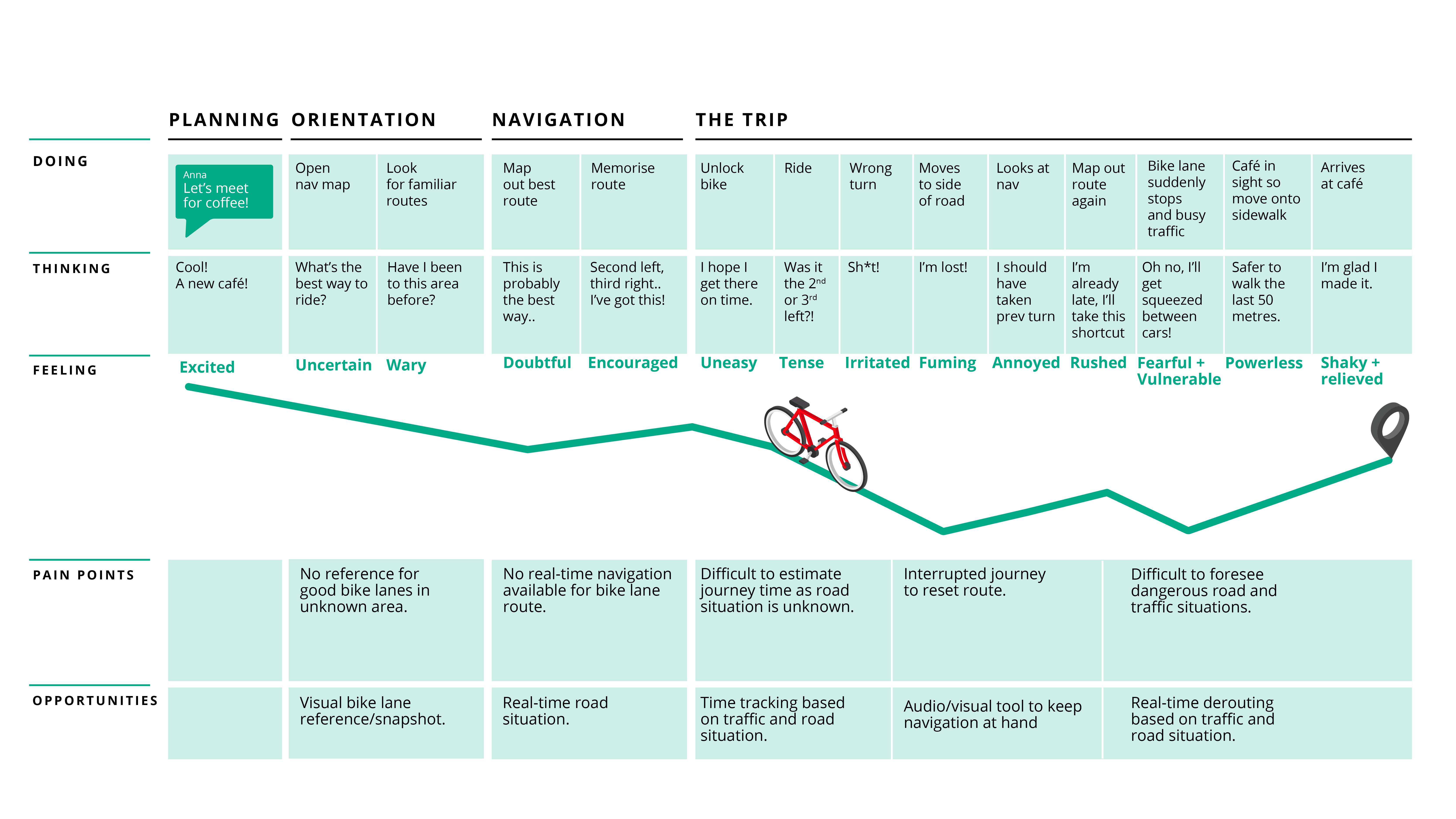
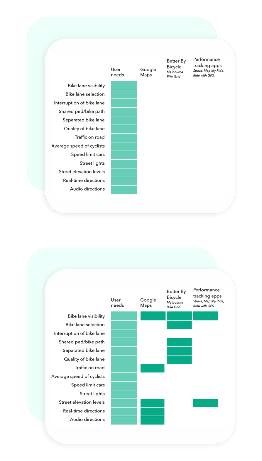
We listed all the opportunities (user needs) that we distilled from our journey map and compared that with competitors.
In this way, we could easily find gaps in the existing offering and identify opportunities for our design solution.
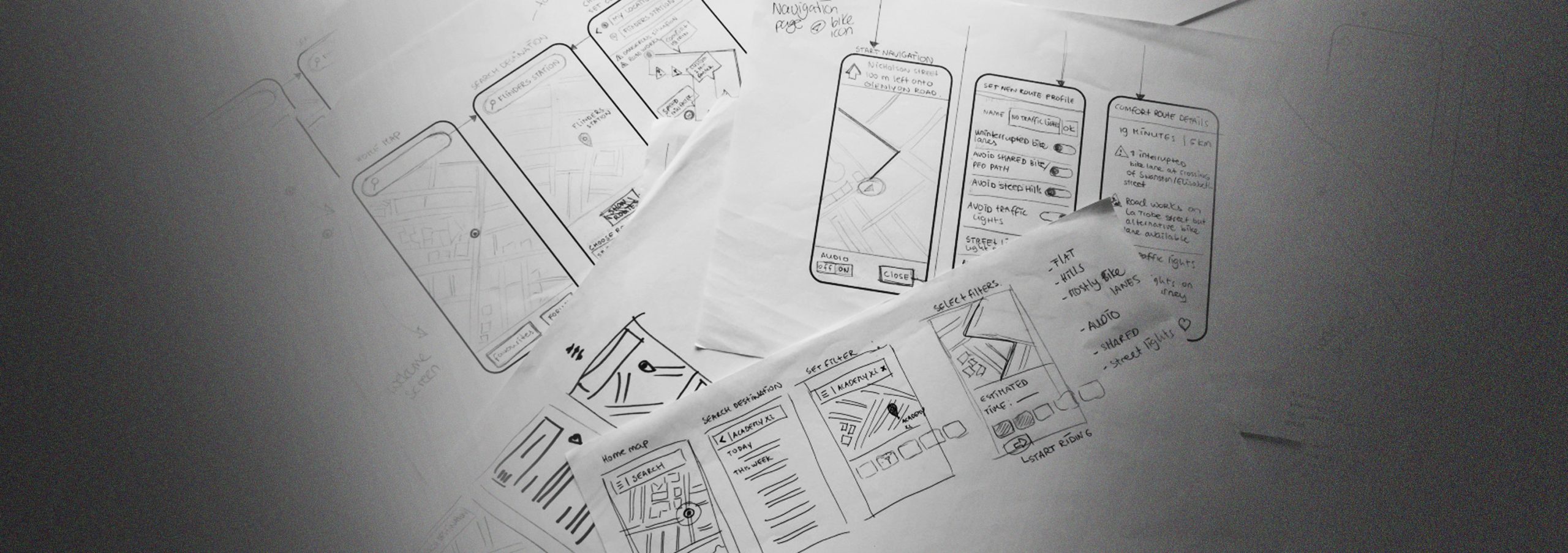
Our user flows are the first step towards designing a solution.
We look at our personas and start drawing out different navigation pathways in our digital environment. As our users are obviously on-the-go, we decided to create an app instead of a website.
